[11 June 2010]
Yesterday I spent a little time writing a stylesheet to make it easier to browse through some potentially complicated and voluminous data. I ran into a problem, and I found four solutions and learned several lessons, which I record here for those who face similar problems.
[“What stylesheet was that?” hissed my evil twin Enrique. I don’t know why he always whispers when asking these questions, but he does. “It doesn’t matter for the point at issue, but since you’re wondering, it was a stylesheet for the catalog files used to organize the XSD test suite. If you’re curious about it, you can see the stylesheet in use for a small sample catalog file.” “This is supposed to be easy to browse?” “Well, click View Source and compare it to the underlying XML.” “OK, I guess I see your point. But where’s the rest of the test suite? Don’t tell me the XML Schema working group has a test suite with … lessee, eighteen test cases?” “Hush. No, of course not. But the test suite as a whole is not set up for interactive browsing on the web. Yet.”]
[“And what was the problem?” “Stop interrupting and maybe you’ll find out.”]
To make it a little easier to see which test cases involve valid documents and which involve invalid documents 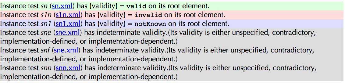 (not to mention documents with [validity] =
 notKnown and test cases with implementation-defined results), I supplied a little pale green, pink, blue, or gray background for the different possible expected results.
So far, so good, but this morning Liam Quin mentioned casually that I might want to consider changing the colors, since the red and green backgrounds would be indistinguishable for some readers. He was right, of course, and the original color scheme was really just a sort of quick and dirty proof of concept, not intended for final use.
“Boy, do you sound defensive. Thought you could get away with it, huh?” asked Enrique. “Oh, hush. Like you never take shortcuts with things.”
So I tested the color scheme using the incredibly useful image analysis tool at VisCheck.com:  you upload an image, and can perform simulations of deuteranopy (red/green color deficit), protanopy (a different form of red/green deficit), and tritanopy (a blue/yellow color deficit). And Liam was absolutely right: the backgrounds for valid and invalid test cases were virtually indistinguishable in the output of the first simulation.
So I set about to fix it, and I learned some things.
First solution. First, I taught myself something about how not to go about this task. Using the helpful Color Sphere widget I downloaded some time ago from colorjack.com, I found a set of three colors that were pretty well distinct in all the different filters it provides: a green, a red, and a blue. They were too intense to use as background colors, so I spent some time with a color picker finding RGB values that matched those hues 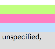 but had less saturation (select the RGB sliders pane, convert from hex to decimal because the widget doesn’t understand hex; change to the HSB pane, slide the saturation level down a bit, go back to the RGB pane, convert the decimal numbers back to hex, write them down) and
 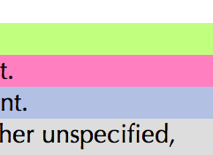 checking the resulting color scheme with VisCheck (update the stylesheet, refresh the page in the browser, take a screen snapshot of part of the page showing all the colors, go to VisCheck, upload, perform deuteranopy simulation, whoops, that won’t work, go back and change one of the colors, come back, upload, perform deuteranopy simulation, upload, perform protanopy simulation, upload, perform tritanopy simulation).
I’m very grateful for these tools, but sometimes I do wish it were more convenient to run all three filters on the input.
After a couple of passes and errors and false starts (which means; after an hour and a half or so), I had a color scheme 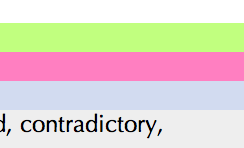 that worked for all the vision types I was checking.
The only problem was that I then decided the green was too virulent and intense.
No problem, I thought: 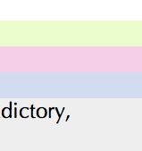 these three hues are good for all three types of color deficit, I’ll just lower the saturation to make them less intense, and I’m good to go. Wrong: on one of the simulations, there was no longer any distinction between the pink and the gray. And the green still bothered me.
So I learned an important lesson: In trying to make colors for data graphics accessible to all types of vision, it’s not just hue that counts: hue and saturation interact with the different deficits.
Second solution. I went back to the colorjack.com Color Sphere widget on my system, and noticed that I could control not just the hue of the primary color but its saturation as well: as you move toward the center of the color circle, saturation goes down. 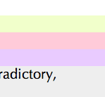 And as you move things around with the deuteranopy filter set, you can see for yourself that the same three hues can be distinct at one saturation and not at another. So I got another color scheme that worked.
Second lesson: if you know in advance that you want the colors to be unsaturated and unobtrusive, use the ability of the color picker / color scheme generator you’re working with, to get close to the saturation and brightness you need. The color picker is better at these kinds of conversions than you are.
The only problem was that as I continued working with the data I grew to like this new color scheme less and less. The green wasn’t virulent any more, but it also wasn’t green; more a greenish yellow.
So I gave up on the assocations green = go = valid outcome, red = stop = invalid outcome. All that matters is that the colors be distinct; they don’t need to be particularly mnemonic (the distinction is, after all, also carried by the text). 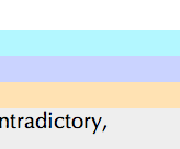 So back to the color picker, once or twice. It gave me schemes that worked in the sense of being visually distinct for normal vision, deuteranopy, etc., but … well, I didn’t much like any of them visually.
Third solution. I remembered that some time ago, I had found a nice monochromatic color scheme for the XSD type hierarchy diagram,  which I had concluded was in fact more attractive than the polychrome color scheme we had started with. So I copied that, and that’s the scheme in use in the stylesheet now.
When I did that work on the type hierarchy diagram, a friend (not Enrique, I promise) asked me “So, can you write down an accessible color scheme I can use whenever I need one, so I don’t have to go through all this hassle of testing things and experimenting and changing things?” I told him no, I didn’t think so: too much depends on the information you’re trying to convey.
But I think one useful general rule can be formulated. If you are looking for a coherent color scheme for data graphics, and the only required function of the colors is that they be visually distinct from each other both for normal vision and for the various color deficits, then one very simple approach is to go to a color scheme generator like the one at colorschemedesigner.com, pick a hue, and generate a monochromatic color scheme (hmm, not all color scheme generators have this as an option). You should definitely use the color-deficit simulations on the result, just to make sure, but virtually all the variation among the colors of a monochromatic scheme is variation in saturation and brightness, not in hue, so the chances are much greater that the variation will be perceptible to all types of vision.
So: third lesson. Try a monochromatic color scheme.
Fourth solution. Another fairly quick and easy solution is to use the Daltonize tool at VisCheck.com, which makes the visual information in an image (in the case of coloring for data graphics, this means the information conveyed by distinctions of color) and makes it more readily perceptible to color-blind viewers by increasing the red/green contrast and by converting information conveyed by red/green distinctions into variations in brightness and on the blue/yellow axis. If you are working with something like false-color photography, where there are many variations in color and tone, things like color-scheme generators are not going to help you; Daltonize is a very cool tool for those applications.
Disclaimer: I know enough accessibility specialists, and enough people with good graphical skills, to know that I am neither one nor the other. I lay no claim to particular expertise in accessibility issues, only to a firm belief that they are important. I think in fact that they are too important to be the concern only of accessibility specialists, just as design is too important to be left only to designers: every maker of Web pages needs to think about the visual communication of information, and about making that information accessible to all the members of your audience. When you do, you’ll appreciate the contributions and the expertise of specialists all the more. (They will remind you, for example, that color-blindness is just one barrier to accessibility, among many. It just happens to be one that lends itself to pretty, colorful illustrations.)
Only when they are accessible to everyone who may need them will your web pages, and The Web, achieve their full potential.